MPG Awards
Marketing Campaign
MPG Awards
Marketing Campaign
Malta
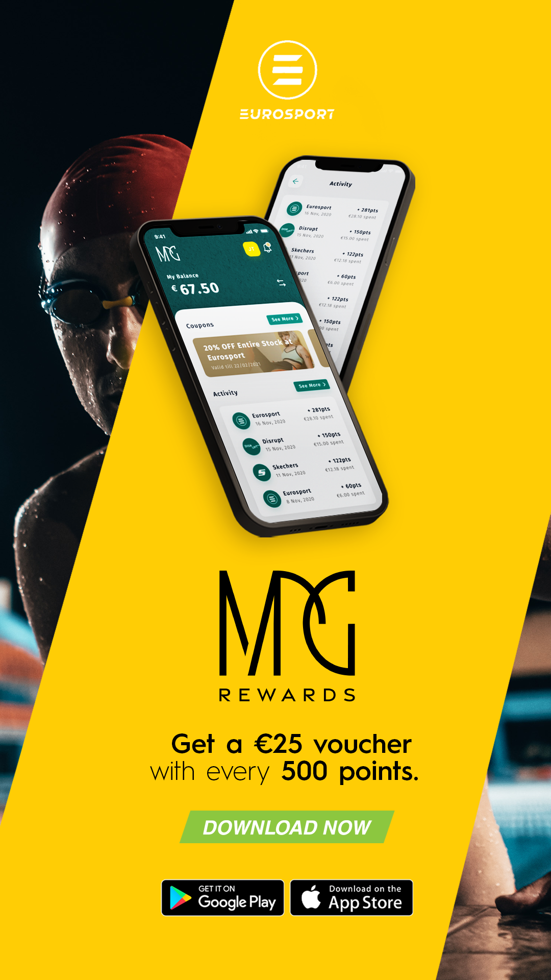
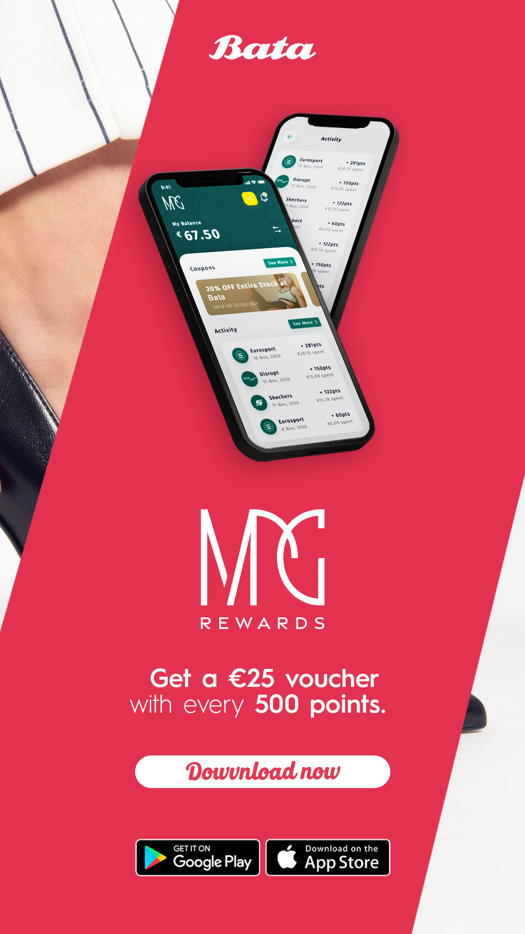
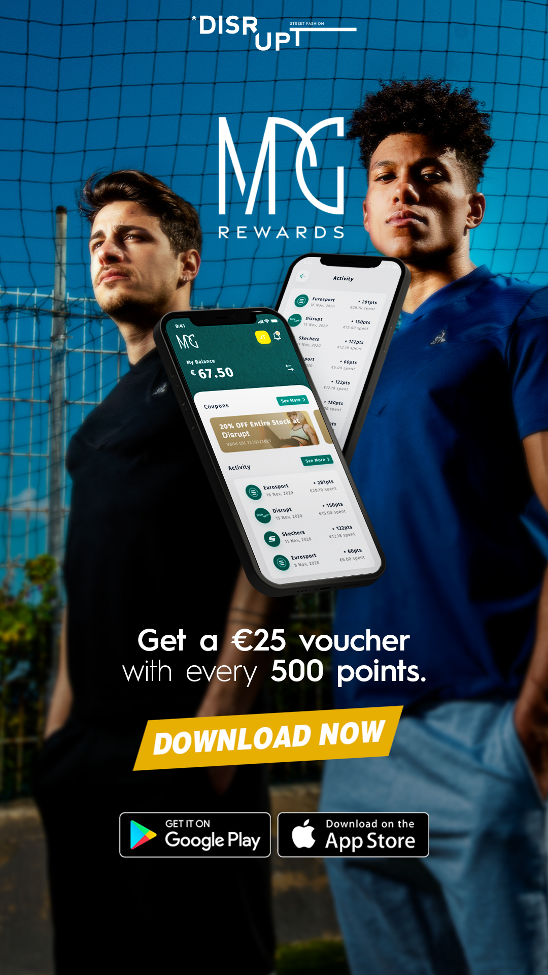
MPG Awards, a prominent Maltese company housing diverse stores featuring sports, fashion, and pharmaceutical brands like Eurosport, Adidas, Skechers, Disrupt, Bata, and Europharma, embarked on a strategic initiative. Recognizing the need for enhanced customer engagement, they introduced a mobile app to streamline data management, offering customers a seamless experience for discounts and loyalty programs.
To ensure a successful launch, a comprehensive marketing campaign was devised. This encompassed meticulous market research, targeted advertising across platforms, engaging social media content, and partnerships with influencers. The campaign aimed to not only introduce the app but also establish a lasting connection with customers, fostering brand loyalty.
Art Direction
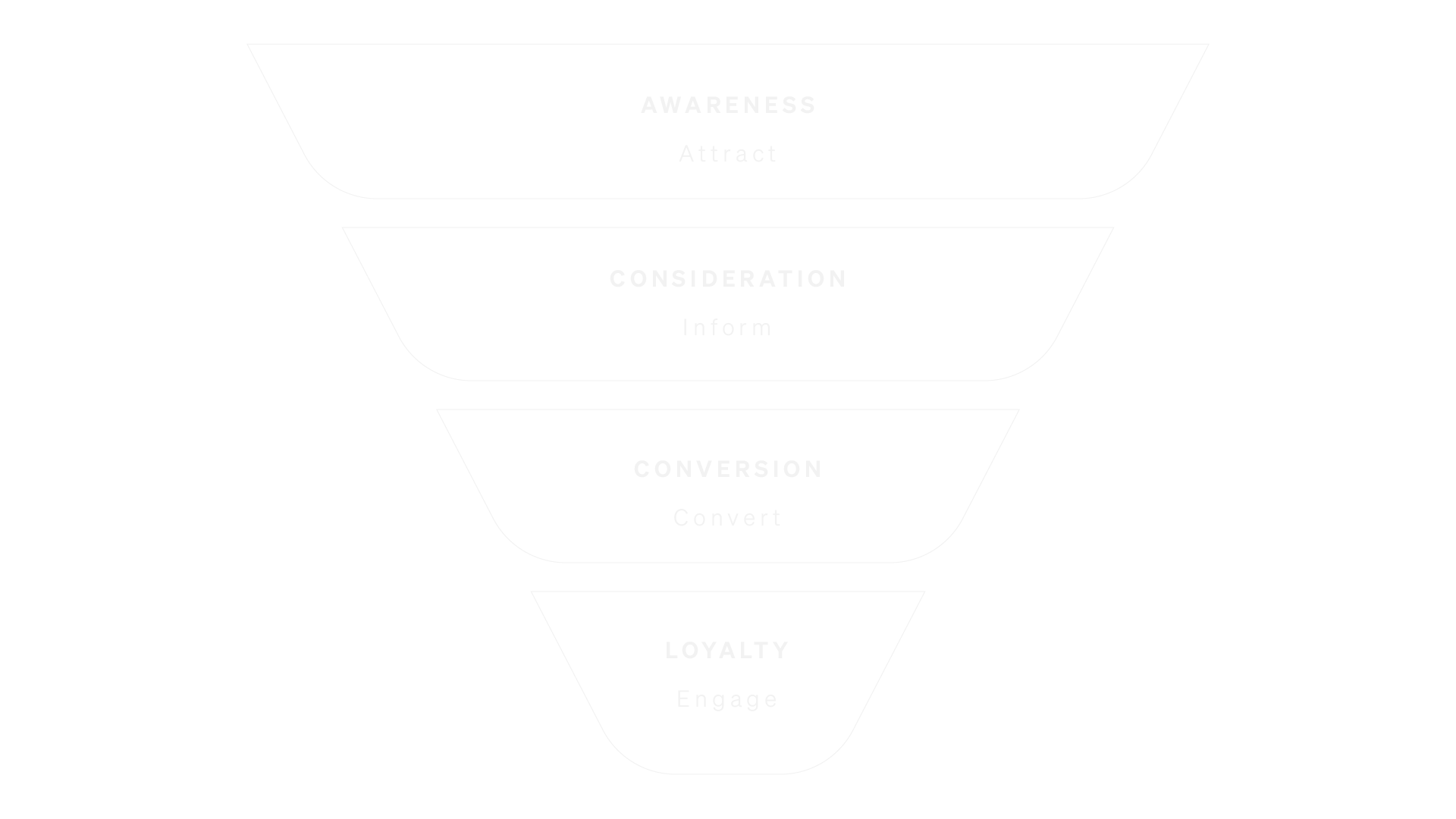
Funnel
Marketing funnel used for this campaign
MPG Awards, a dynamic entity based in Malta, crafted meticulous brand guidelines with a focus on engaging a diverse audience, spanning from teenagers to seniors and encompassing various social layers. Each brand within the MPG Awards ecosystem is carefully characterized by distinct colors, serving as visual identifiers that resonate with the targeted demographics. The decision to employ a neutral yet recognizable font across brands ensures a cohesive identity while allowing for individual brand expression.
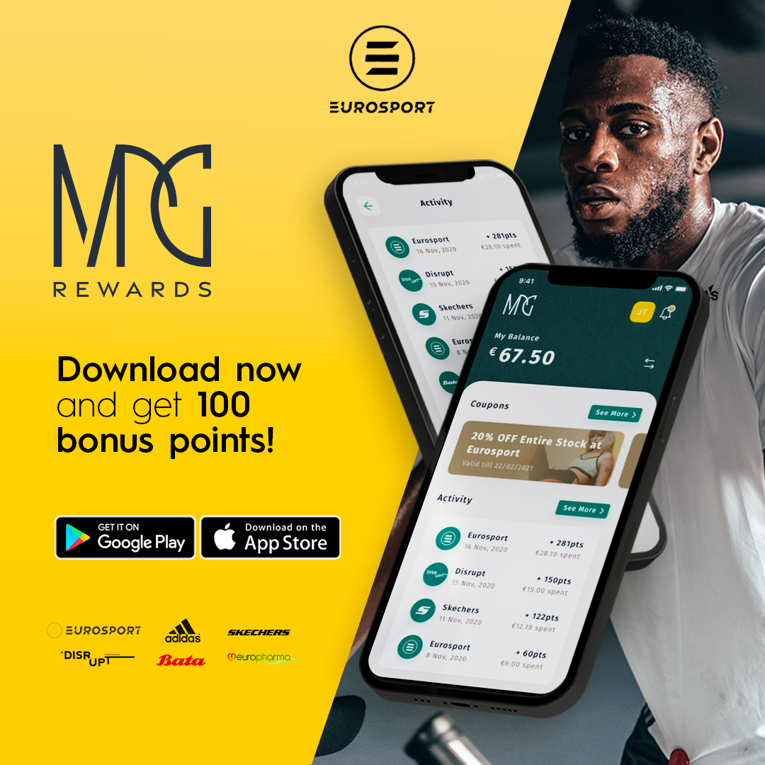
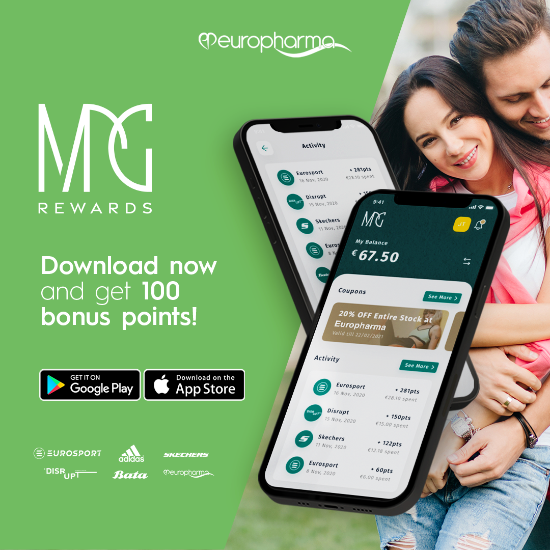
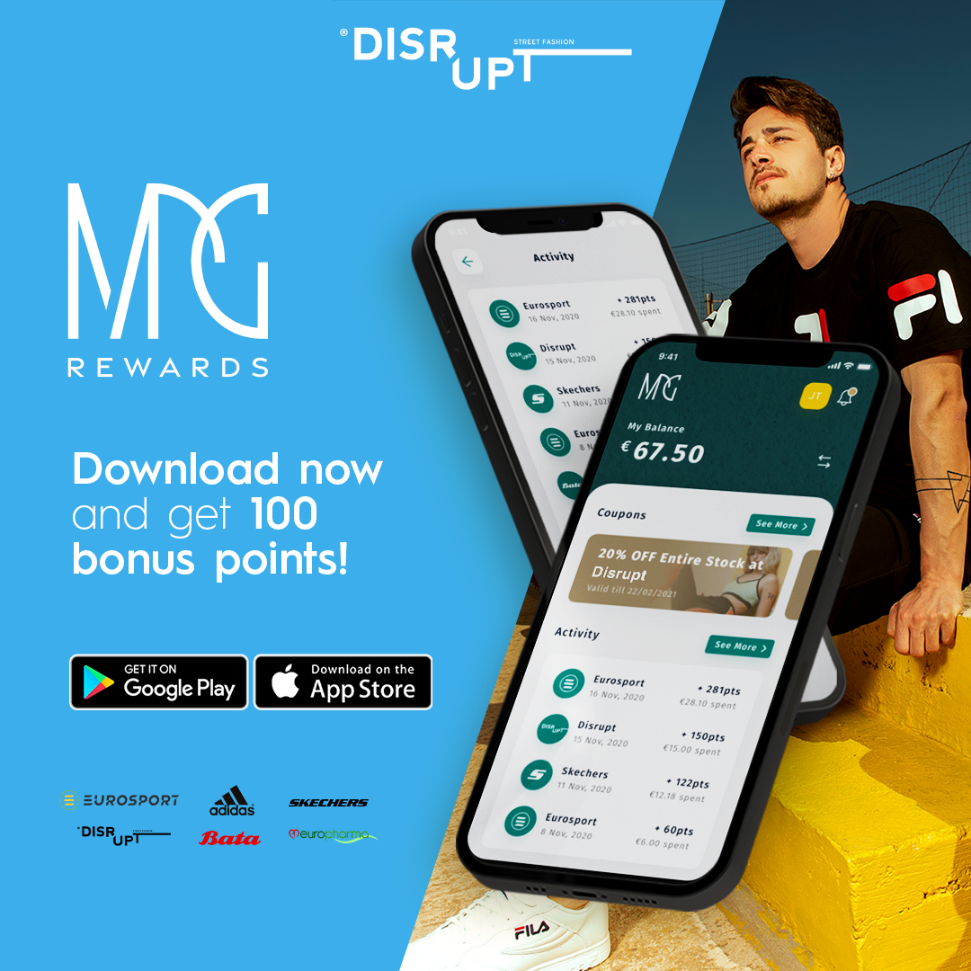
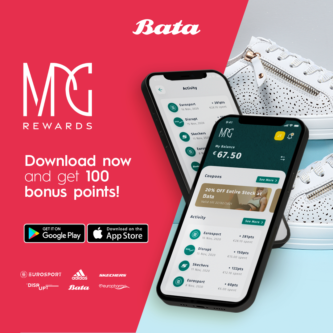
The diverse portfolio includes Eurosport, representing general sports outfits, Disrupt, catering to the younger demographic with trendy sportswear, Bata, offering an extensive range of footwear for men and women of all ages, and Europharma, specializing in pharmaceutical essentials. The challenge lay in creating a design that would appeal to this broad spectrum of consumers, incorporating elements that showcase design flair while prominently featuring the mobile app as a central component.
Through thoughtful consideration of colors, fonts, and brand associations, MPG Awards not only achieves brand consistency but also successfully navigates the complexity of catering to a wide audience, making the brand guidelines a blueprint for resonating with diverse demographics and ensuring a visually appealing and cohesive brand presence.
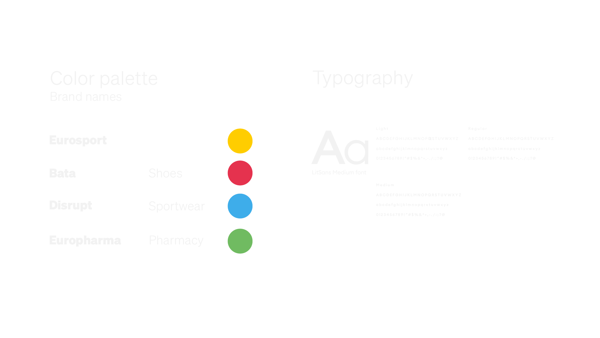
Color palette and design elements
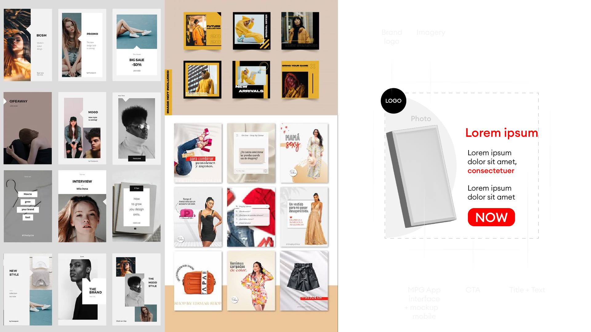
Moodboard and concep
Development
MPG's art direction exudes dynamic energy, employing a distinctive slanting element to infuse graphic interest. Each brand under MPG's umbrella is characterized by a unique color palette, ensuring individuality and brand recognition. However, in campaign deliverables, a harmonious blend of all brand colors is artfully used, emphasizing the unity of the MPG identity. The Call-to-Action (CTA) shapes are thoughtfully customized to accentuate each brand's unique features; for example, Eurosport integrates slanting elements into its CTA design.
To maintain a seamless visual narrative across offline and online platforms, a consistent composition and configuration were meticulously applied. The entire creative process, from conceptualization to development, was a collaborative effort led by myself and my dedicated design team, resulting in a cohesive and compelling brand presence for MPG.
Awareness
Online
Consideration
Online
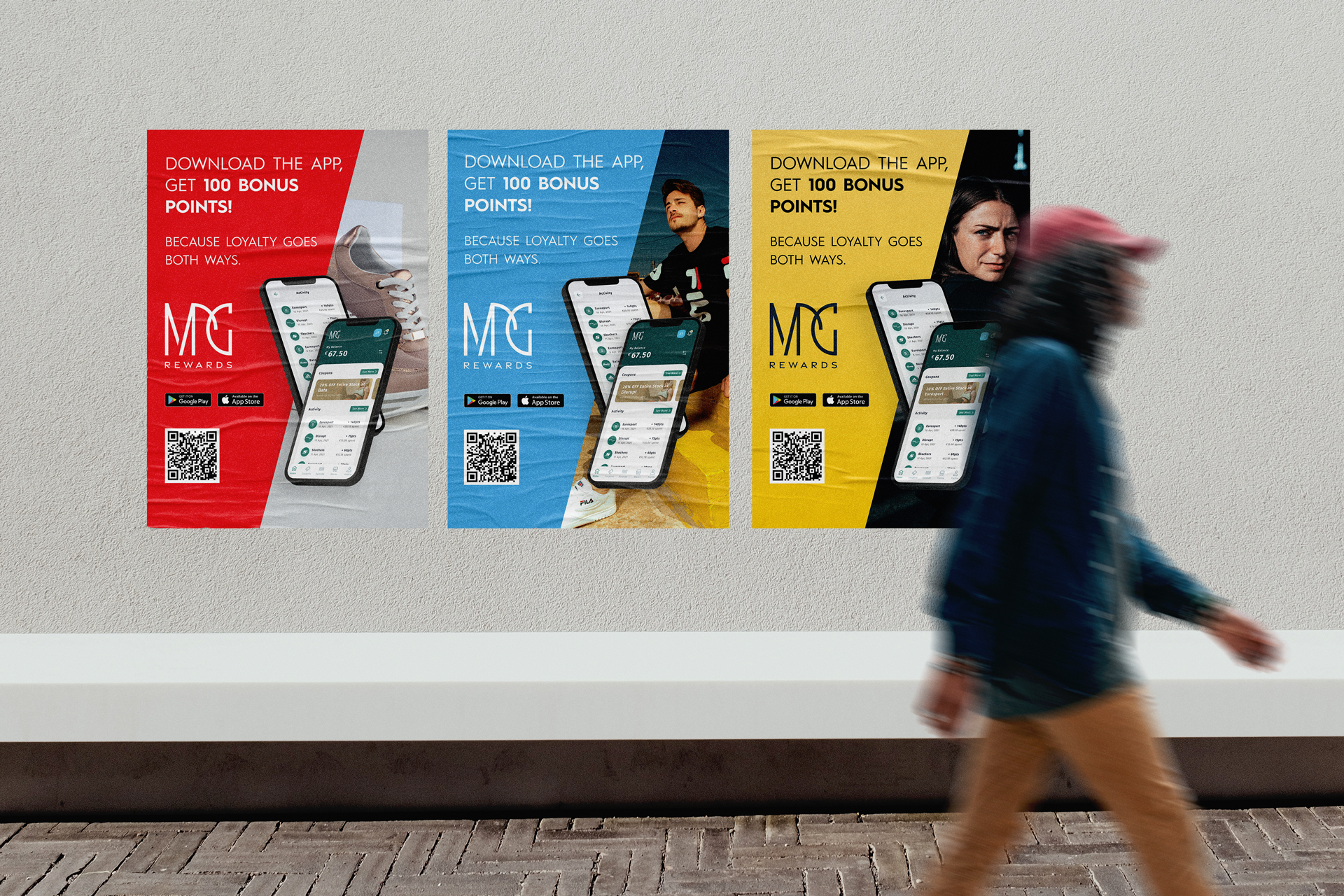
Posters
Format A1
Conversion
Television AD
Offline
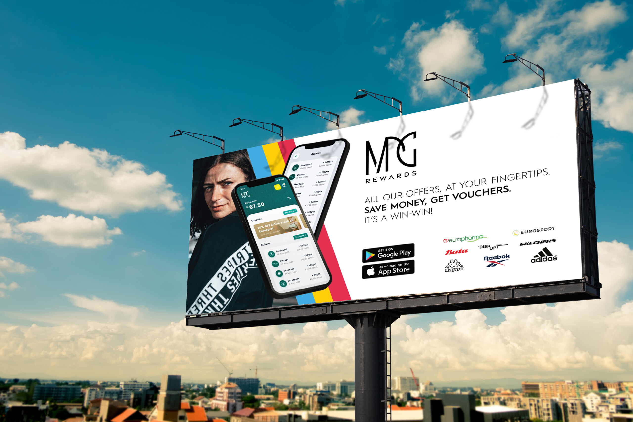
Billboard
Offline with all brands
Loyalty
Social Media
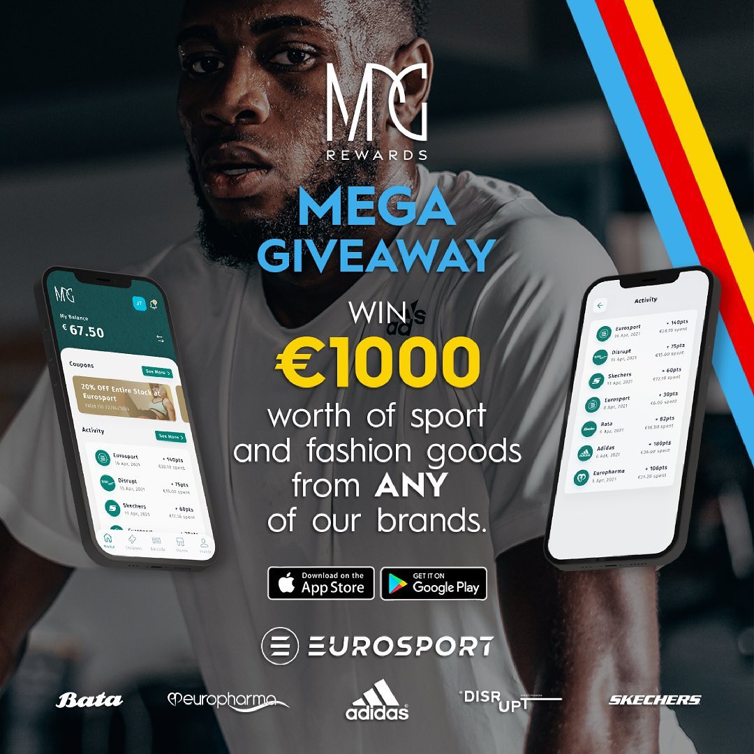
Givaway
IG/FB post
Challenge
Working on the MPG project as a Senior Graphic Designer was a captivating experience where I assumed the lead role in both art direction and execution of each deliverable. Collaborating closely with a talented team of junior graphic designers and interns, I navigated the creative process with enthusiasm.
Engaging directly with the Senior Growth Manager and the Creative Director, I ensured alignment between design concepts and overarching campaign objectives. The creative journey was not only intriguing but also presented an opportunity for process innovation and improvement. My focus was on enhancing design consistency and introducing elements to elevate graphic interest throughout the campaign.
Challenges arose with new brand introductions towards the project's conclusion, leading to some communication misunderstandings from the client's end. Despite these hurdles, the campaign emerged as a resounding success. The experience showcased the significance of effective collaboration, adaptation to evolving project dynamics, and the resilience of the creative team in achieving the desired outcome.
