Alternative Technologies
BranD Identity
Alternative
Technologies
GreenTech
Solar Panels
Alternative Technology in Malta sought a transformative branding identity project, driven by an acknowledgment of an outdated visual identity. The imperative was to realign with competitors and contemporary trends. Embracing sustainability, locality, and market leadership as core values, the rebrand showcases a modern logo, a palette inspired by Malta's sunny landscapes, and sleek typography.
This strategic metamorphosis not only positions Alternative Technology as a leader in the solar energy market but also underscores their commitment to sustainability, resonating with a local audience while projecting a dynamic and trendsetting image in the ever-evolving landscape of solar innovation.
Concept

Research about different trendy design style

Research about the ambient and the mood of the brand
Our team dedicated extensive effort to curate a comprehensive mood board, shaping the design style for Alternative Technologies, a pioneering green energy company specializing in solar panels in Malta. Our exploration centered around the core values of sustainability, expertise, market leadership, and new technology. We delved into styles resonating with keywords such as technology company, trendy, emotions, light, energy, and dynamic.
The mood board seamlessly weaves together various design elements that encapsulate the essence of Alternative Technologies. By prioritizing a brand position exploring the emotion and archetype of knowledge, we aim to create a visual identity that not only communicates technological advancement but also resonates emotionally with the audience. The concept places a strong emphasis on the importance of the human element, reflecting expertise and ecological consciousness. Through this, the design intends to convey the vital role individuals play in the realm of green energy, emphasizing expertise, and a commitment to ecological stewardship.
Development

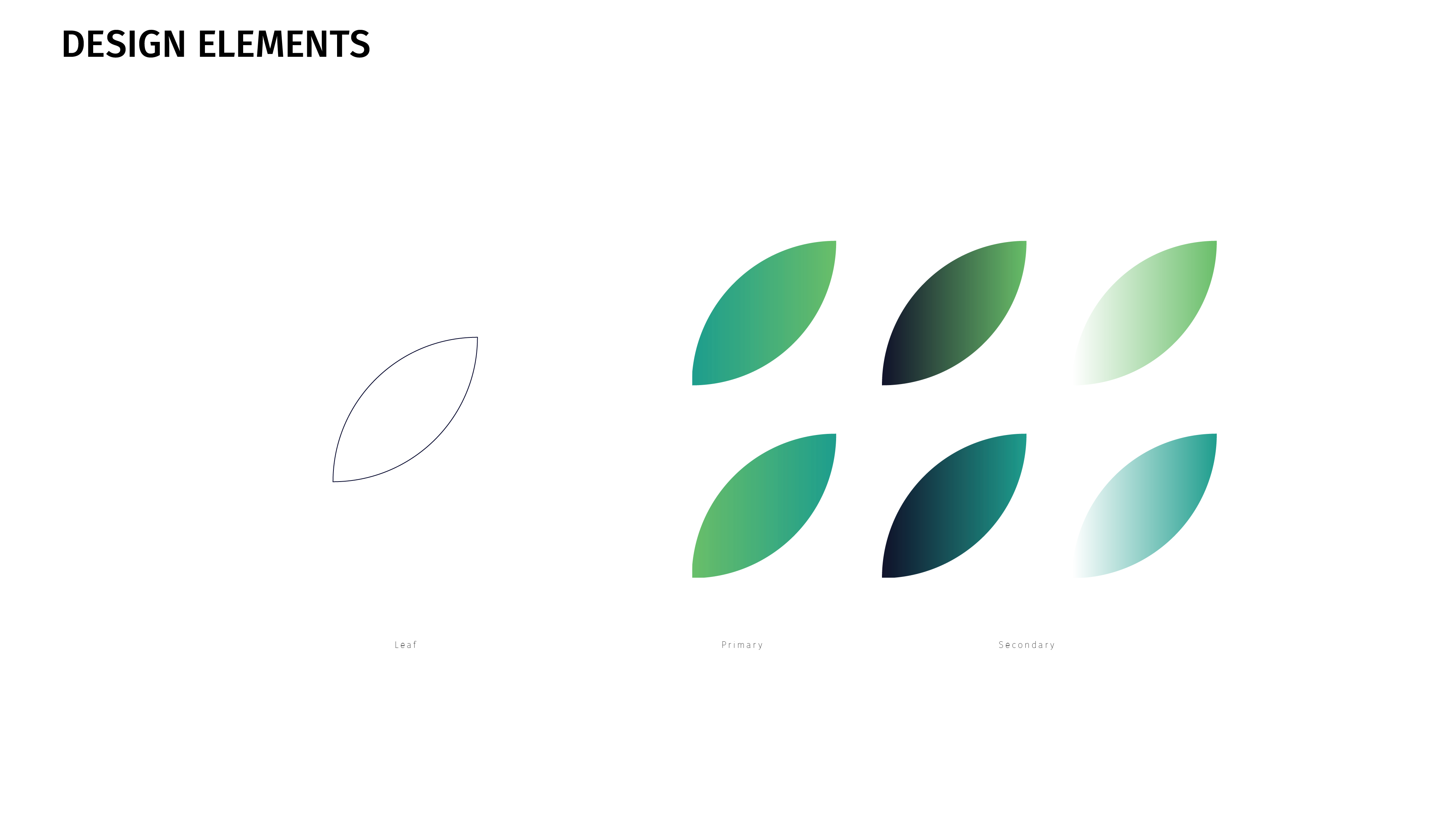
Using the circle shape to build a shape that highlights energy and sustainability
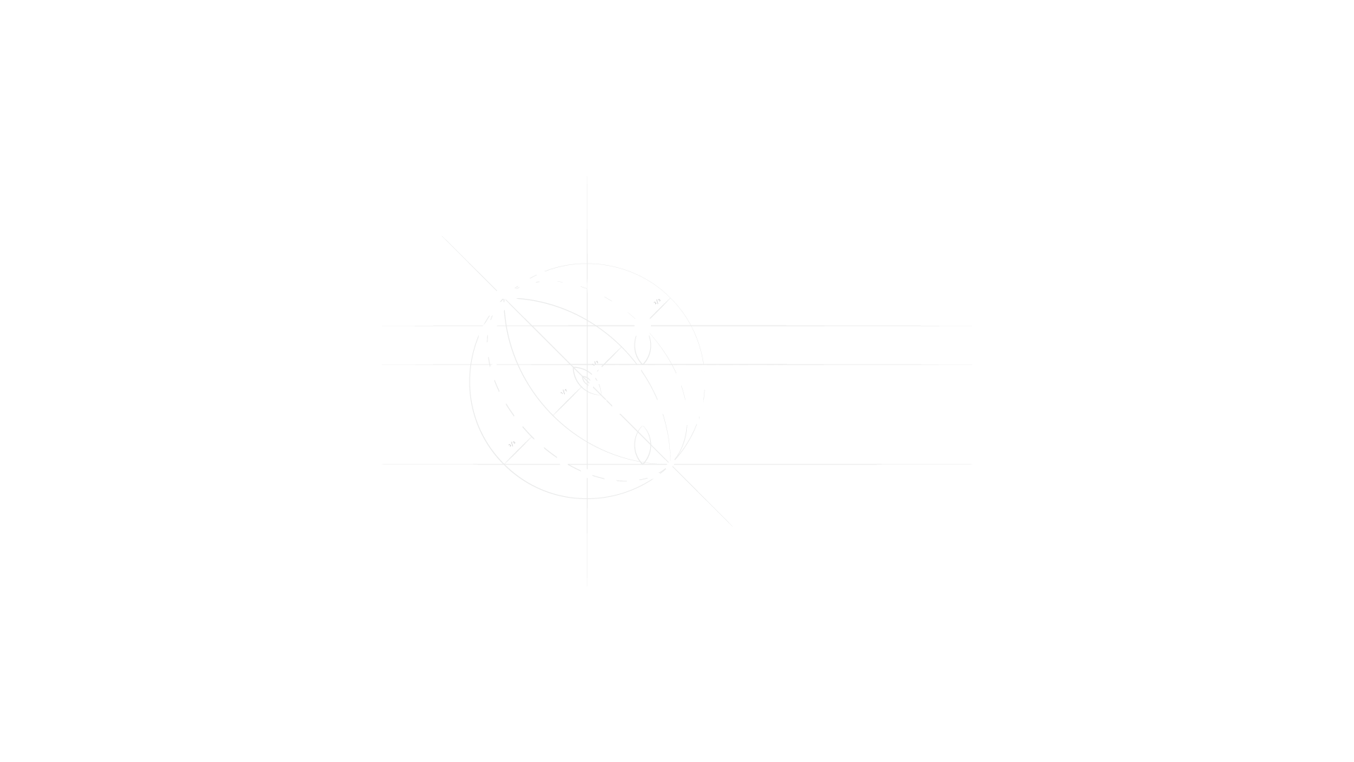
Through a deliberate design transformation, the initial form has evolved into a sophisticated amalgamation of intricate shapes and compositions, strategically accentuating the themes of energy, sun, future, and technology.

Alternative options for the logos exploring the concept of sun, energy, and light.


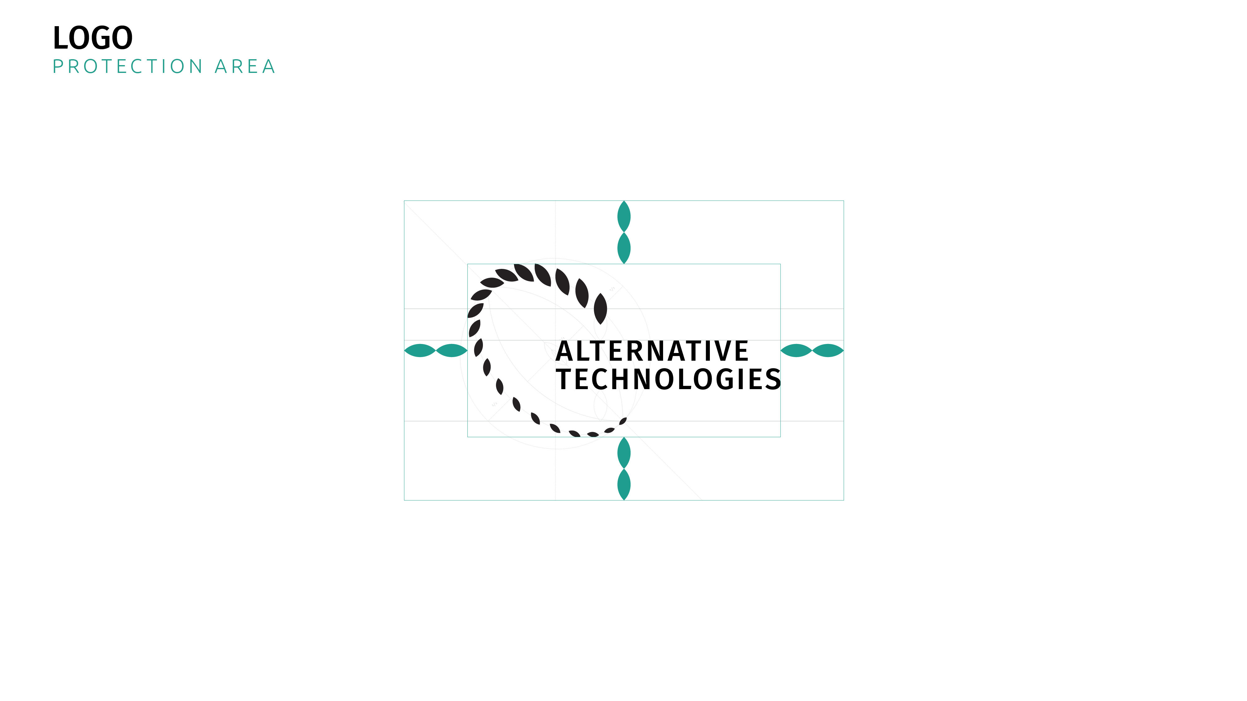
EnergyTech-inspired shapes of the brand mark emphasize the energy, sustainability, sun, and future
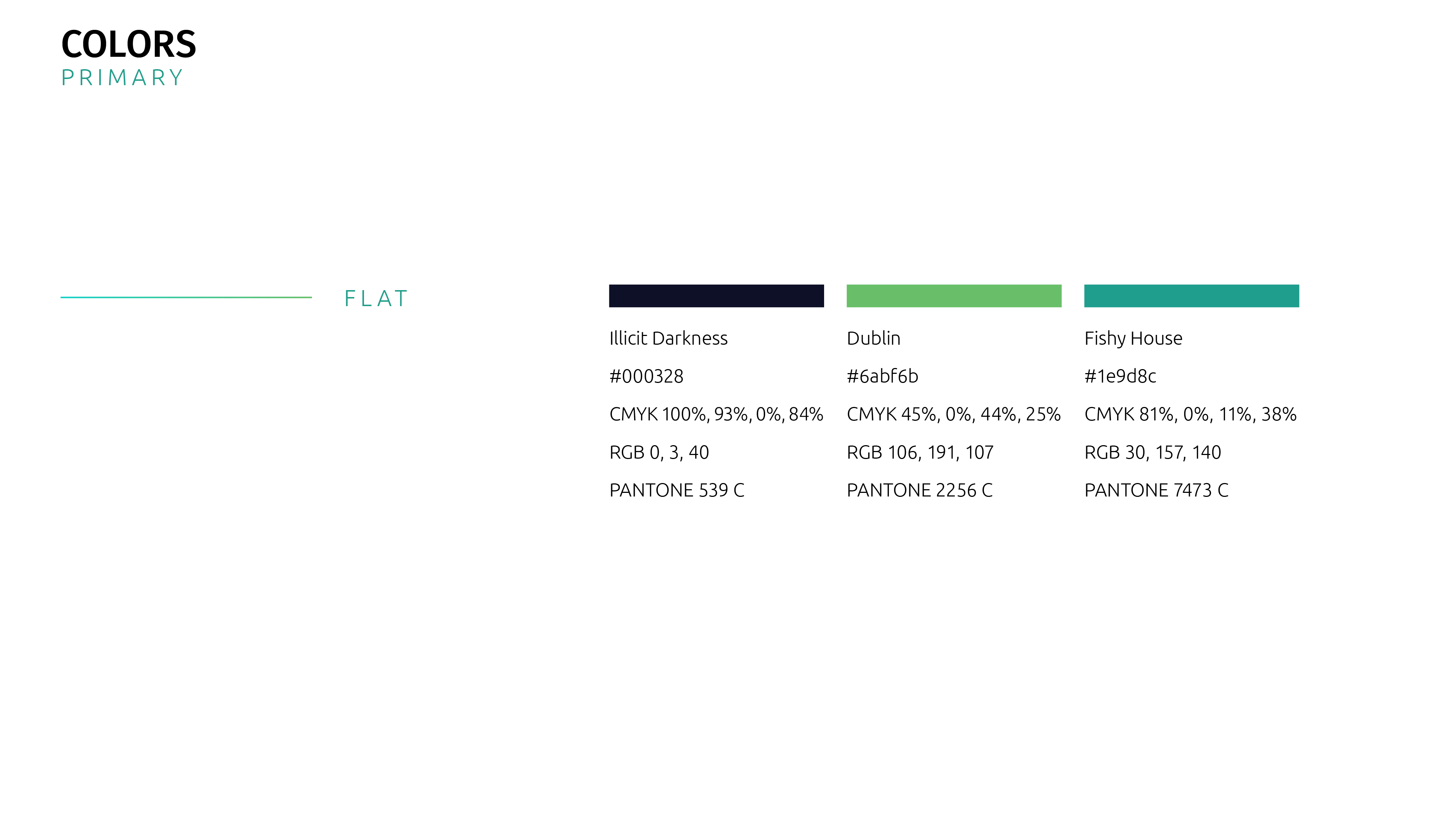
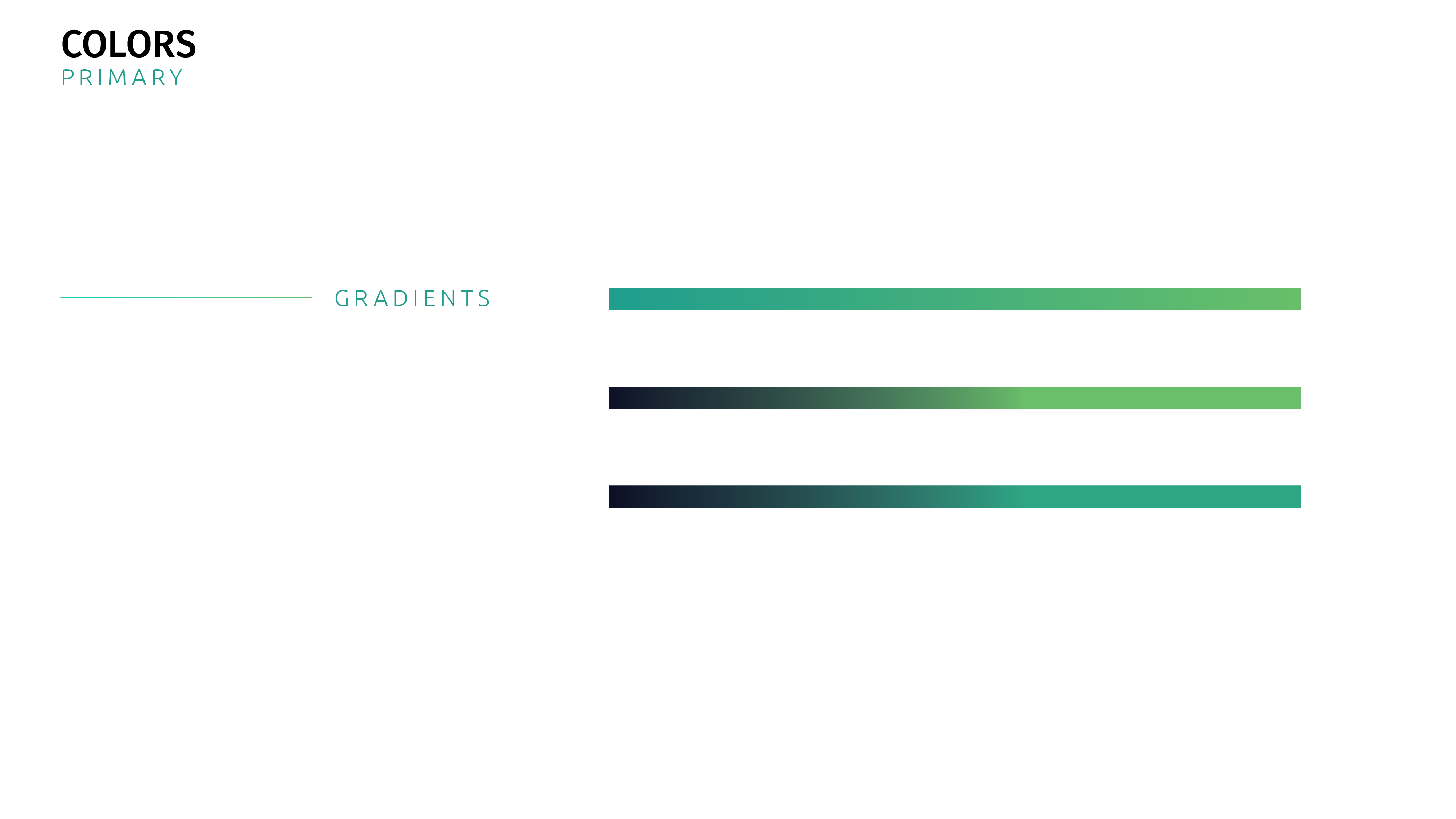
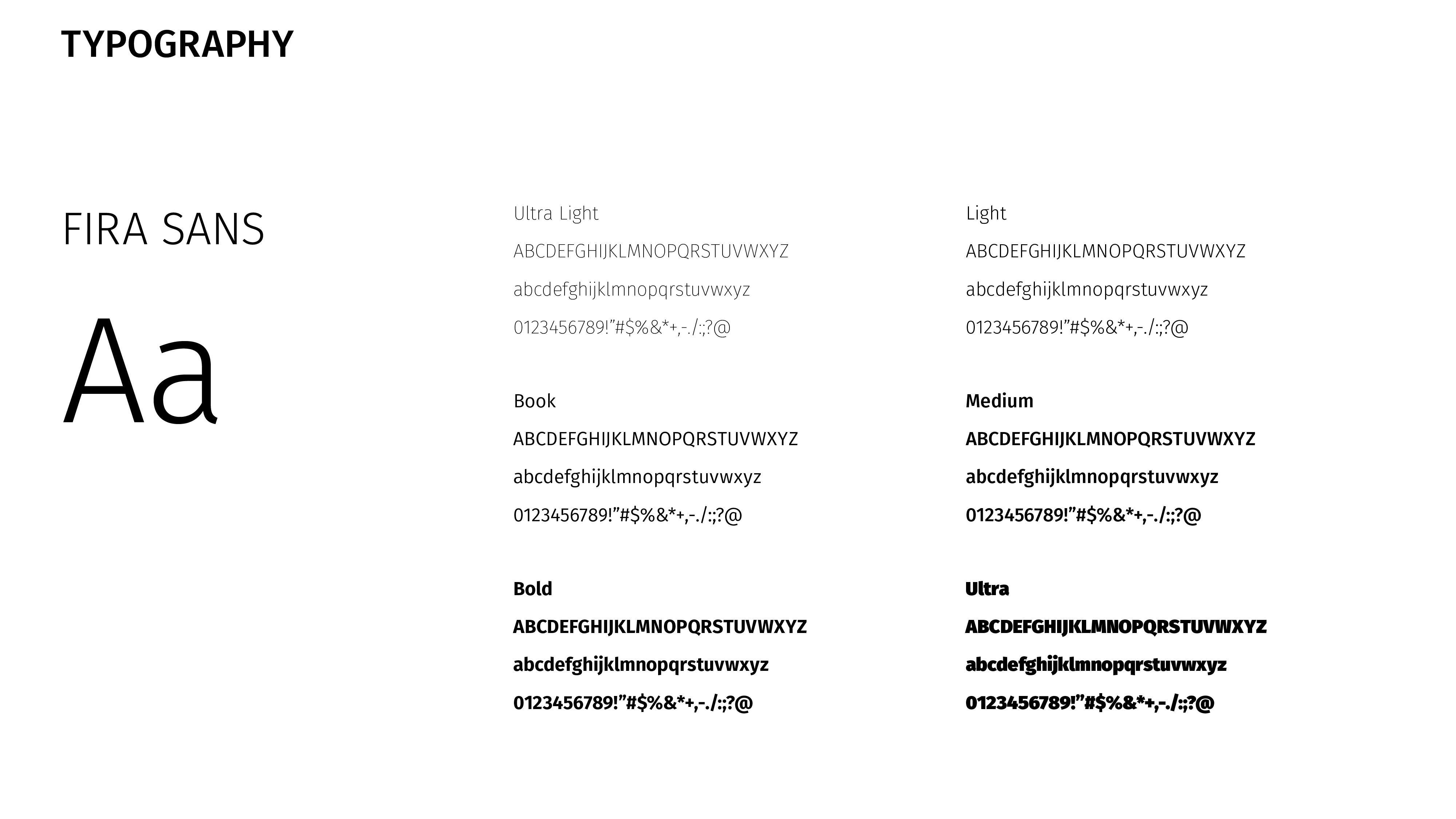
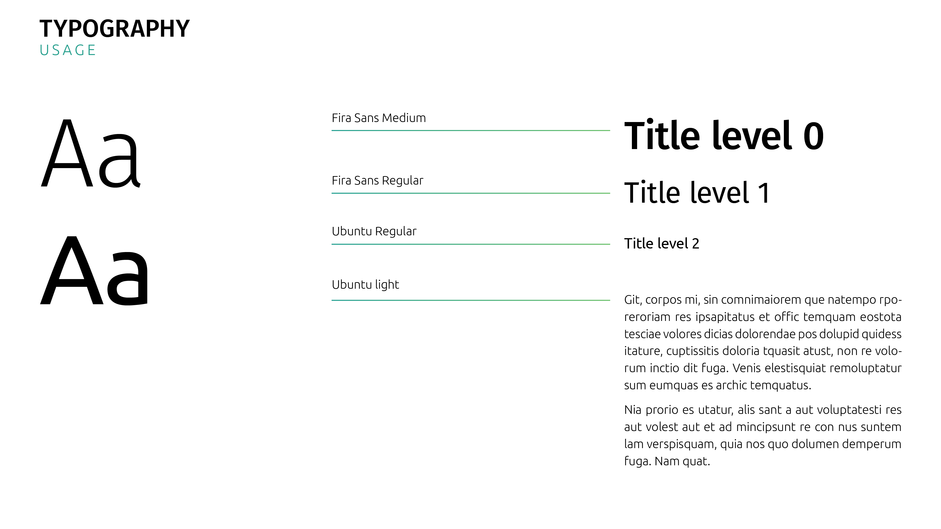
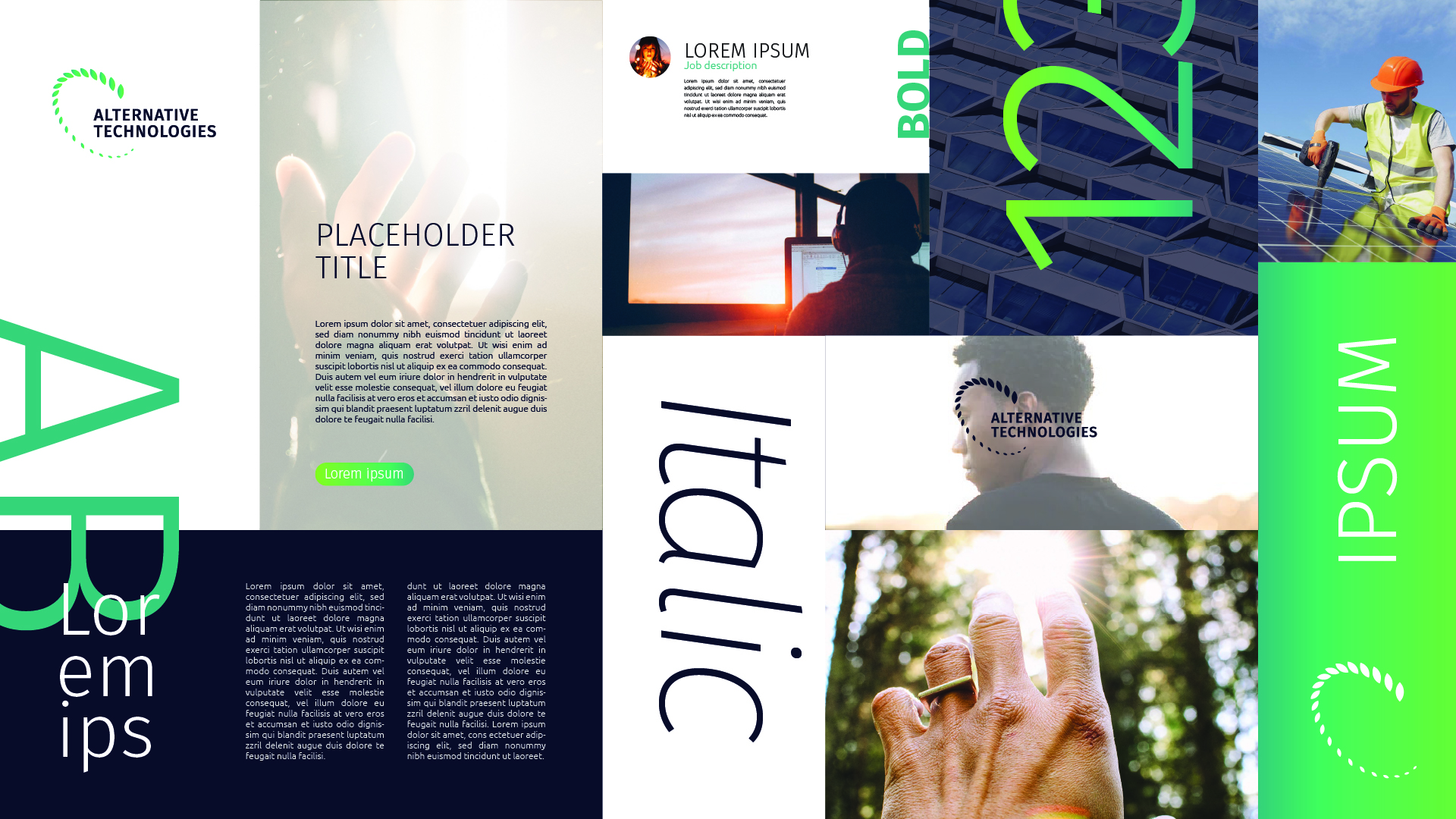
The typography and color palette adds modernity, embodying the essence of ecology aspect.
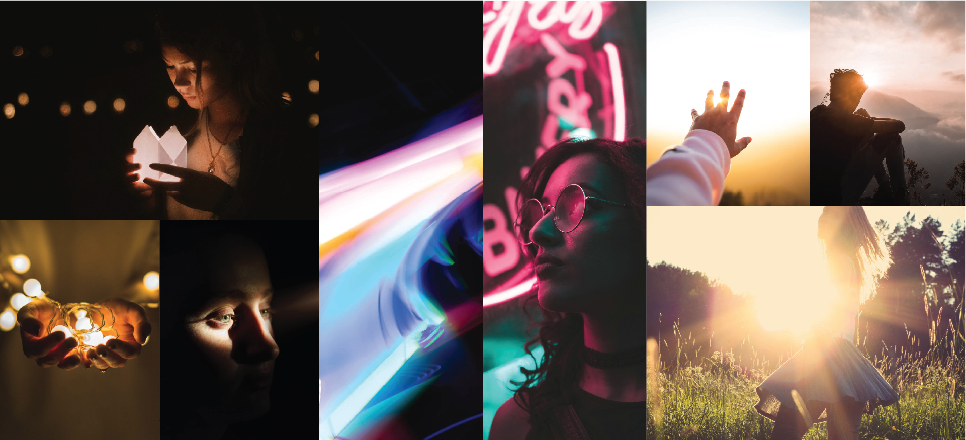
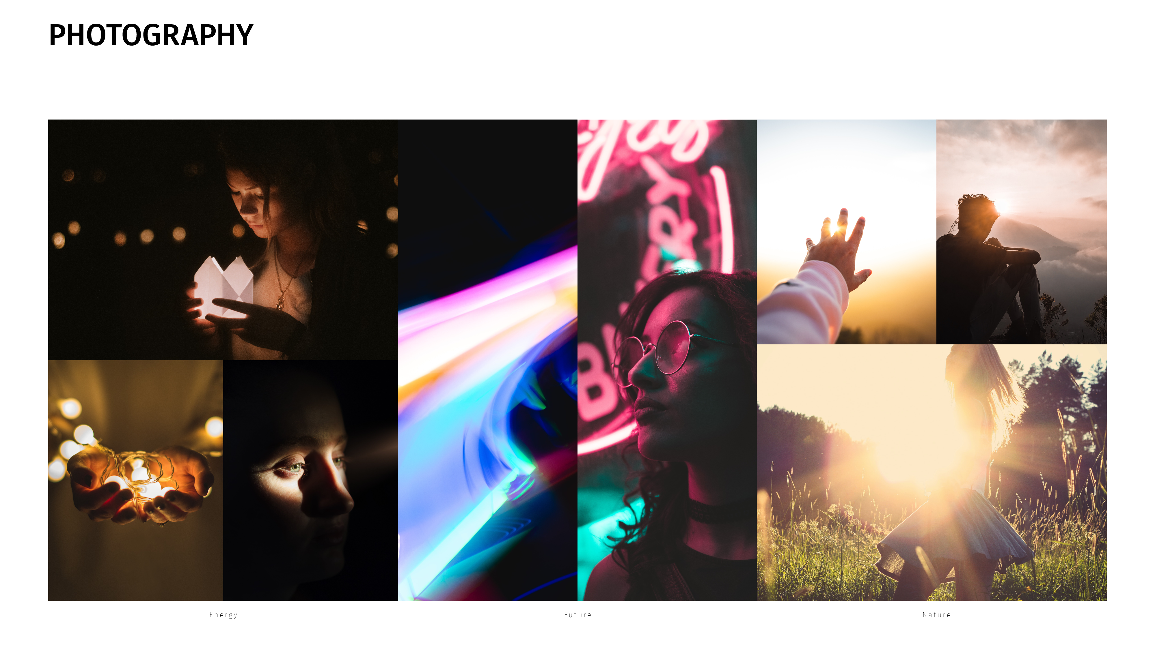
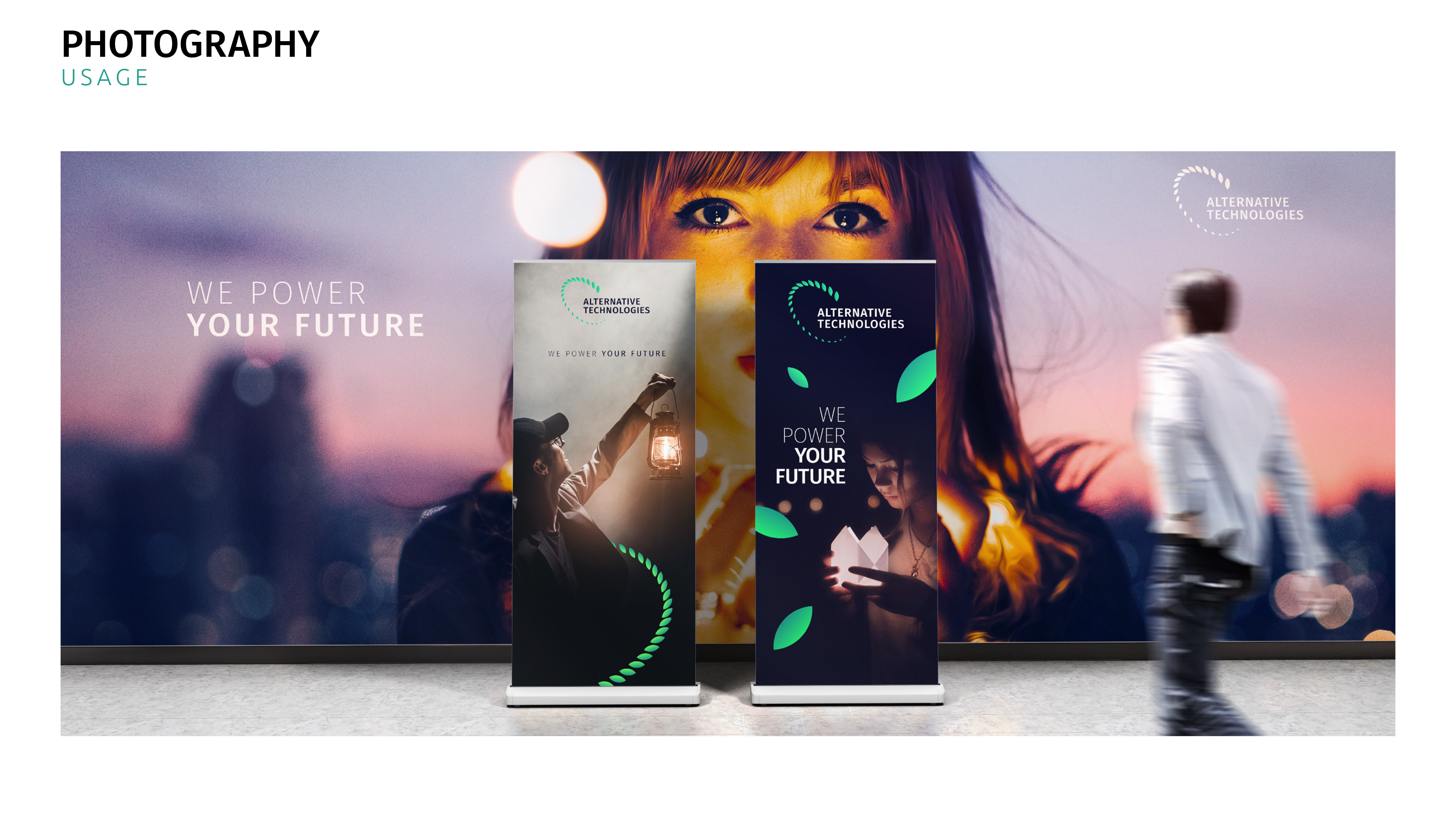
Photography direction plays with emotions and vision of future.
Applications
Creating a mood board for the future art direction

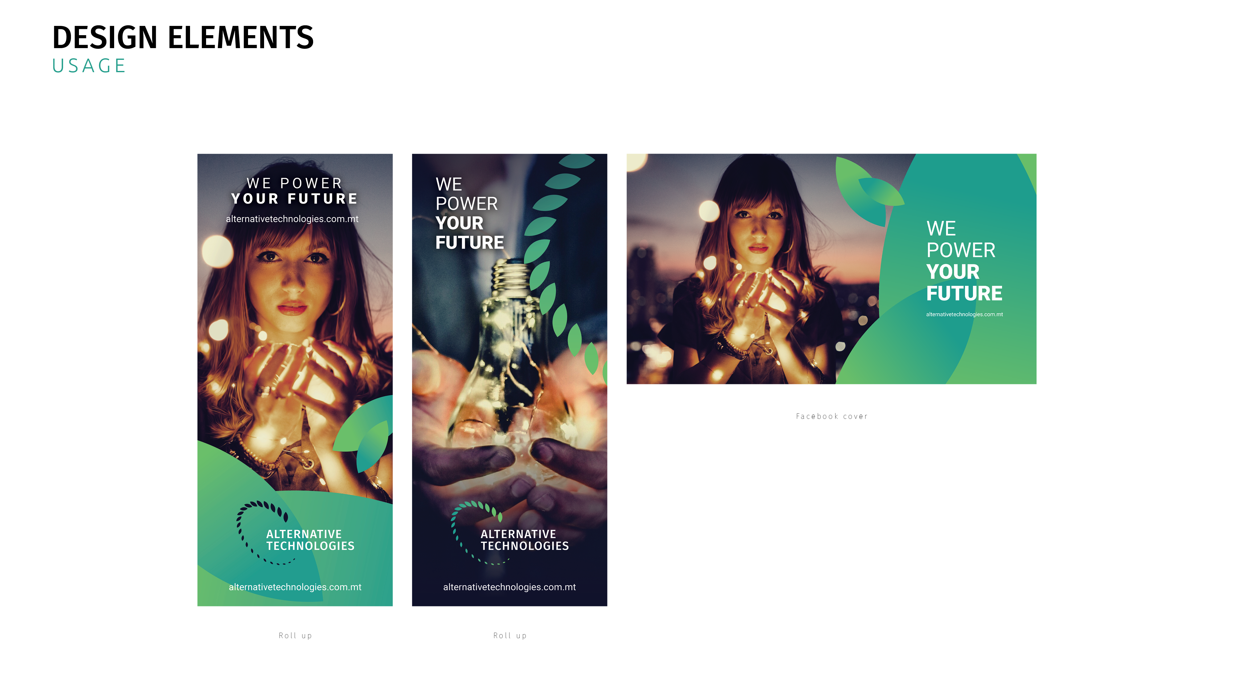
Creating two rollups for a conference
